
Property management is defined as the daily oversight of residential, commercial, or industrial real estate. In PHS Properties case, they outsource the majority of their property management to 3rd party companies local to the listing. After talking to the client, it was clear they were frustrated with their current system as it lacked access to key features necessary to their operations.
Throughout the discovery process, it became clear that the following problems were prevalent.
Poor mobile experience - layout is not very intuitive and UI elements are confusing
Lack of schedule clarity - calendar provided no details about bookings and no ability to export the calendar itself
Poor financial visibility - financial chart had a frustrating interface with no info regarding # of reservations
Limited access to content - no ability to manage images or text for the listing
No regard for accessibility - colorblind individuals would have a difficult time navigating the portal
No visibility of other rental sites - forced users to search for their own listing across every other booking site
Offers zero guest insight - no ability to view data about guests (i.e. reason for stay, age, etc)
Following the discovery phase and problem definition, I began to construct use cases to outline user flows and the resulting clickstreams. Each use case would follow a user story pertaining to a specific persona. With the established user flows in mind, I could now proceed to create the appropriate UI elements to fit each use case.
Use case #1 - David, a property manager, needs to block off the calendar for a reservation from a 3rd party site. The optimal user flow would entail linking the account to the 3rd party's owner portal, and utilizing the integration from the 3rd party site to automatically create the calendar reservation. Taking advantage of these existing APIs, this would be far simpler than manually transferring information into the calendar where David would otherwise have to select dates and a reason for the hold, and finally reserve the property for the requested dates.
Use Case #2 - Elizabeth, an out-of-town homeowner, is very concerned with her guests experience. She wants to offer a luxury vacation and is intent on ensuring each guest leaves feeling happy and refreshed. She wants to be able to quickly see her reviews and address any guests concerns before they become larger issues. After noticing a guest leave a poor review about the shower not providing ample water pressure, she would like a new shower head installed in the master bathroom. The optimal user flow would be to submit a detailed maintenance request right after reading the review, and then to reserve the next available dates for the work to be done. Once the project was finished, she could update her social media account with pictures of the new shower head.
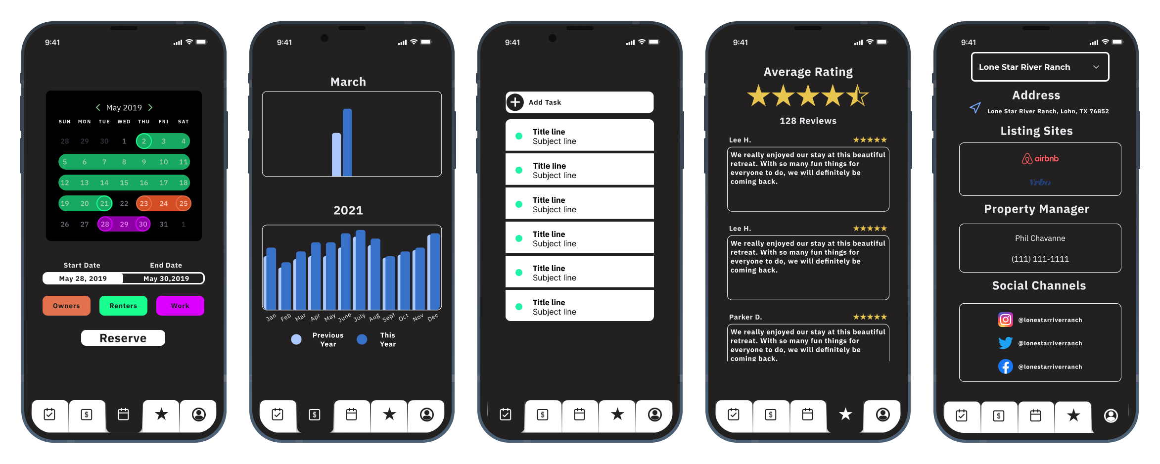
Use Case #3 - Stephen, another homeowner, wants to ensure his short term rental property is a good financial decision. At the very least, he wants to know whether his rental income has improved since the pandemic last year, both in terms of number of bookings, but also the average value of each booking. The optimal user flow would allow Stephen to immediately compare last years financials to this years, and extra information would be available when the chart column was clicked.
We felt these three use cases covered a broad range of scenarios that the users might encounter.
With the necessary UI elements now laid out, the next step was to tackle the information architecture of the app. The goal was to display as much data as possible without overcrowding any particular page, thereby taking advantage of any available white space. Utilizing a tabular pagination structure, each page would contain relevant information that ought to be grouped together. I determined the center page to be the home page to optimize scrolling, meaning the further page would at most be two swipes away from the center, as opposed to the typical structure of the far left page being the home.
It was clear that the calendar should be readily accessible for the property manager/owner and thus determined to be the home page. At a quick glance every booking for the month would be visible, with more information available when a booking is tapped. Being able to display events happening on the property at a quick glance enables users to get an idea of when rentals, work, and owner visits can be scheduled. Lastly, users are able to add events to the calendar from this screen. By selecting the start and end dates, the type of event, and then clicking reserve, the event would be added to the calendar. An additional piece of functionality I would like to add in the future is a year view, where the overflow would encourage the user to scroll through each month of the calendar to view the schedule at a high-level.
To the left, the financials page would offer insight into the property's performance, both for the month and year. Data here includes # of rentals, average rental value, total rental value, and percent gain YoY. Documents such as 1099s etc, would also be visible here for a desktop view, as we felt it unnecessary since no user would be accessing those from a mobile device. One element I would like to add in the future is a property comparison tool to other rentals in the area. This would allows homeowners to gauge how they are doing within their market, not just against themselves.
On the far left is the tasks page. The idea here is that the user would write a task, and then be prompted to reserve the property for that work to be done. If no reservation was required, it could be skipped. This would then write to the iOS Reminders app and notify the user of the task to be done when they arrive at the property.
To the right, the reviews page would display all the reviews accumulated across the internet. By linking a Facebook page along with booking sites, the reviews would automatically be uploaded here. To respond to a review, the user would simply tap the review and be directed to the associated site. This would simplify the process because it wouldn't require the integration to write data to the third party, simply read it.
Finally, on the far right, the profile screen would include all relevant links to social media accounts and 3rd party sites, allowing the property owner/manager to quickly integrate the calendar and reviews from the other sites. It would also enable the owner to create multiple listings for different properties and flip through them quickly. By listing the property manager on file, the owner would have easy access to reach them on short notice. I debated utilizing some sort of internal messaging system here, but determined it would be easier to simply reach them by phone.
With these all wireframed, it was time to implement the interactions for a fully functional prototype.
Future elements to be added - calendar prompt from tasks